Chicago Budget Data Visualizations (2017-2020)
7.15.2020
Click to view my Chicago Budget Visualizations
Recently some of the interesting work I have been doing was focused on creating data visualizations using javascript and D3. I wanted to have a project where I could make a new visualization and work on something personal. I have also been looking at ways that I could use the data from the City of Chicago's Open Data Portal (https://data.cityofchicago.org/). This portal contains all kinds of datasets related to the city of Chicago and is a great resource for analysis and visualizations about the city I live in.
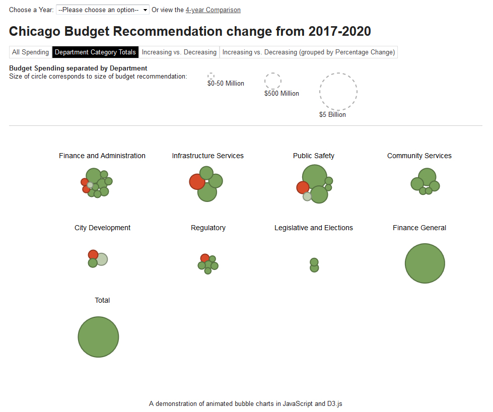
I have seen bubble charts used by the New York Times in budget proposals dating back to Obama's 2013 national budget so I thought this would be a useful visualization and is also good experience as I haven't worked with bubble charts before. So the result is a series of charts and transitions between views for the city of Chicago's financial budget data for the past few years.
I collected and cleaned the datasets from the portal, then made a few basic calculations and categories to break it into logical pieces and created CSV's of the relevant info. Next I customized a few bubble chart examples to work with these views and datasets. And finally set up a simple website to navigate through them and uploaded it here: Chicago Budget Data Visualizations (2017-2020).
Hopefully this is a somewhat useful representation of this kind of data and could bring insights more quickly then just looking at a table of numbers. If not it's still good fun and practice for me!