Prehistoric Timeline + Map Data Visualization
11.21.2022Lately I have been working on a new app/data visualization. I though that showing prehistoric life with a timeline and mapping visualization would be an engaging way to display the information. It also served as a project to learn more about Svelte which has been a great experience. Svelte is a lightweight javascript compiler that allows you to create components and also gives reactivity and default controls for user interaction. These are common requirements for data visualizations and Svelte handles it well.
Interesting notes about the visualization
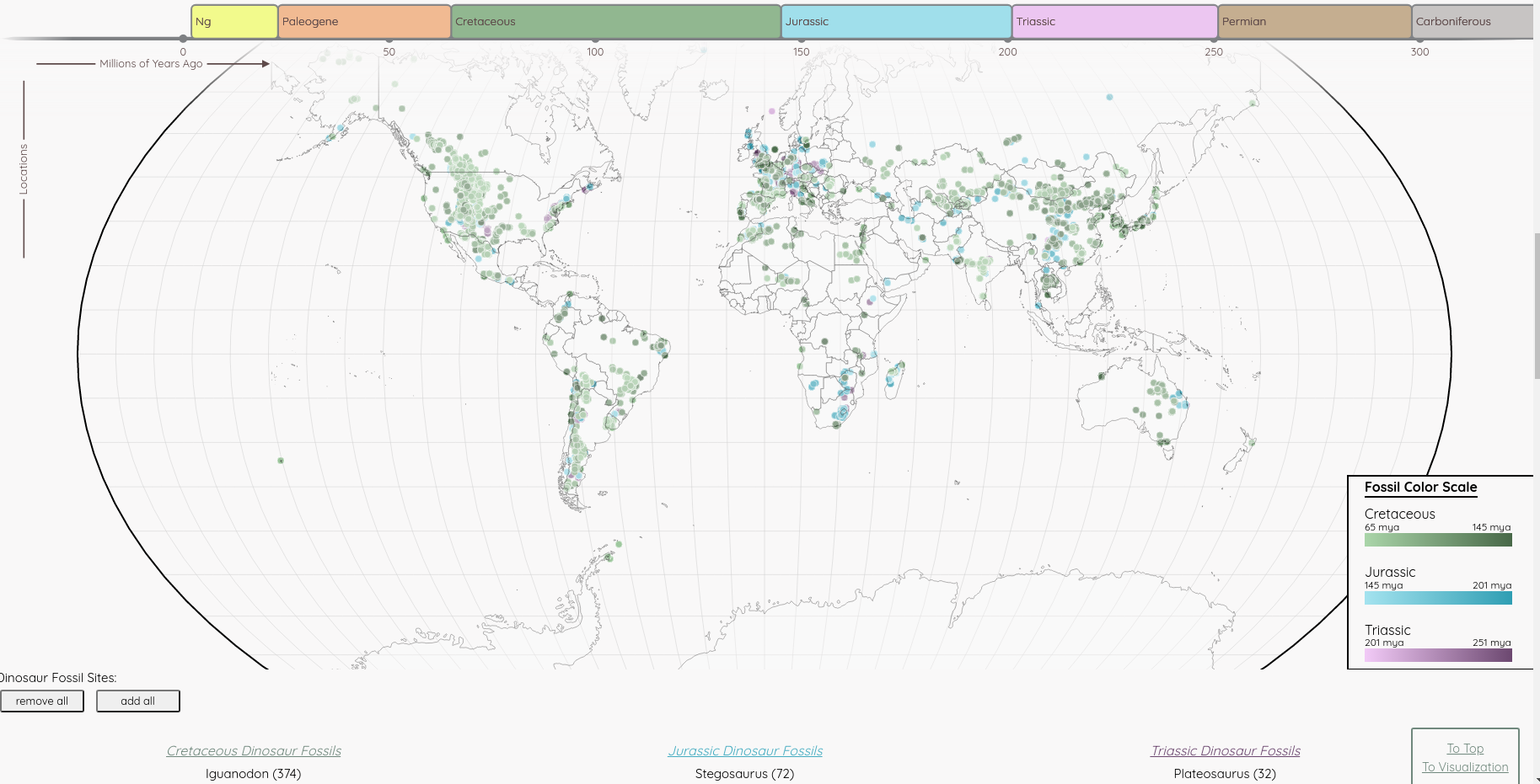
It uses a combination of D3, SVG, and Canvas elements to create the different visualizations. The main visualization is a timeline + map showing the prehistoric creatures in chronological order by time period. It maps them to their location of origin and also displays fossils at their discovery sites. An overlay of pangea can also be projected onto the map.
- The fossil sites on the map are Canvas elements, which enables relatively good performance for the visualization even when rendering around 20,000 datapoints. Using Canvas over SVG will give performance benefits when dealing with very large datasets.
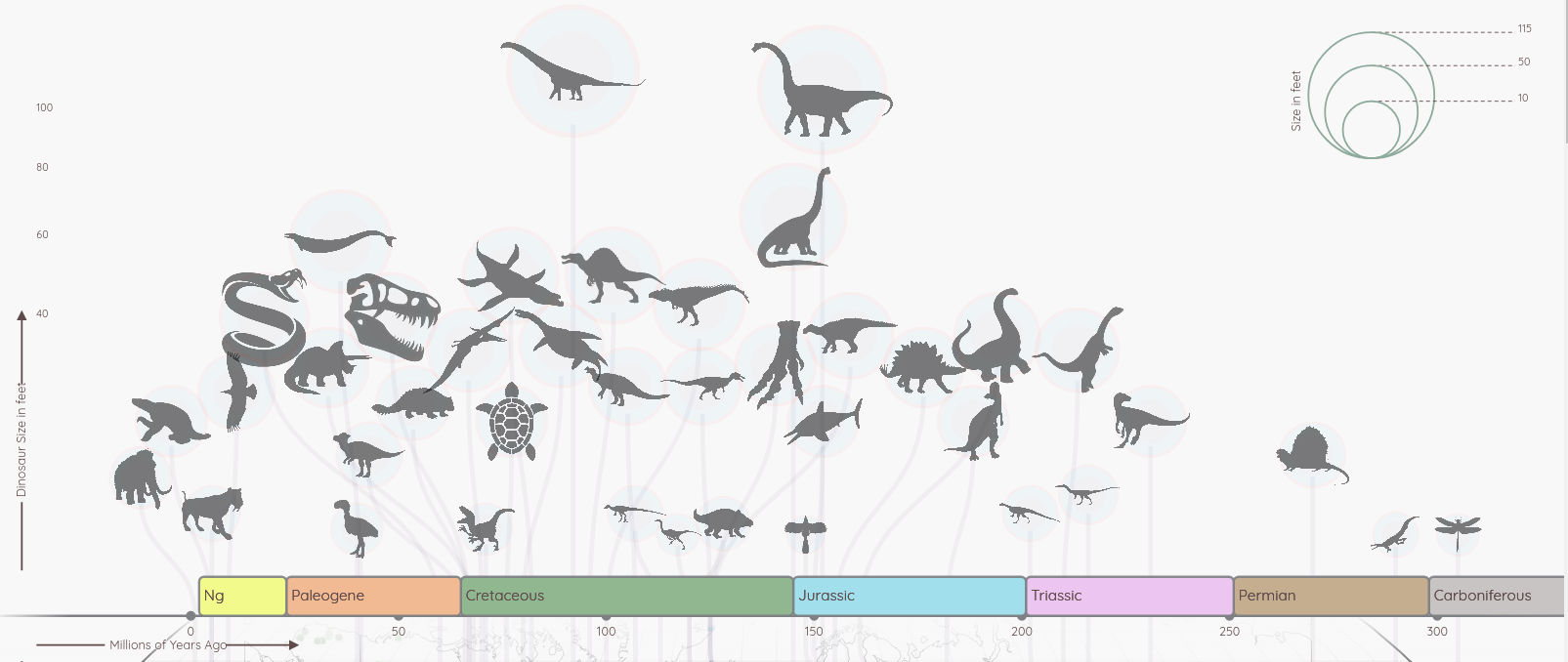
- The radius of a circle representing a data variable can use a square root scale to keep the area of each shape the correct relative size. Since a circle's area is pi r^2 if you link the variable to the radius using a linear scale the shapes area will increase at a disproportional rate. This is used to size the SVG circles above the timeline. Their radius is sized based on a square root scale.
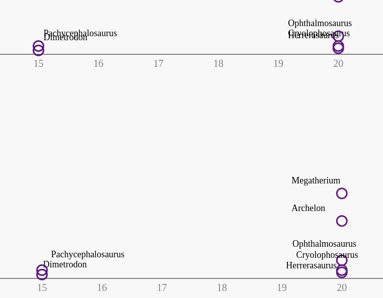
- The timeline SVG circles also make use of a simulated force. It helps ensure there is minimal overlap between the elements. However on the scatterplot the elements are allowed to overlap. No force is applied, but the scatterplot labels positions are adjusted by a function until they do not overlap. These can be effective tools depending on what you are trying to show and if precise locations of visualized elements are necessary.
More About This Project
Code available on Github here. Created using all free resources and open source code:
The fossil data is from the Paleo Database at Paleobiodb.org
The timeline + map section were originally forked from the open source Svelte visualization project and influenced by the Foreign Interference Attribution Tracker and it's developer Matthias Stahl (higsch | data & design)
Additional images and information from Smithsonian Dinosaur atlas, Wikipedia, and other free sources